 |
We've had a small exhibit on the back wall of Center Camp at BM the past two years, which has attracted a big crowd. People also filled graffiti books with their answer to "wdydwyd?"
Plans for 2009 are at this link
|
BM organizers have liked it so much, they are giving us more space this year!


Below are our (evolving) plans for this year. | Collaborators add comments, ideas, etc.!
 |
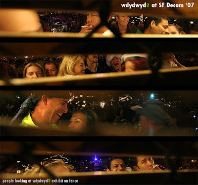
<— To the left are some shots of people looking at the same wdydwyd exhibit at Decompression in SF.
Note: the camera is looking thru the fence at people.
|
IDEAS FOR THIS YEAR — Wall size | Height = 8 feet | Width = 4-ft sections
1) Past exhibit panels — [7 sections = 28 feet]
2) New exhibit panels — (BM 2007) [1 section = 4 feet]
3) BM staff-portraits panels — [1 section = 4 feet]
4) "Collaborating Artists" exhibit panels — (WWA, HIV, UCLA & UNC) [2 sections = 8 feet]
5) "Curated submissions" exhibit panels — (this is a juried selection from submissions on JRS, Flickr, etc.) [2 section = 8 feet]
6) A MOSAIC — (I'll let Jonathan describe below) [1 section = 4 feet]
7) GRAFFITI WALL — (markers for people to write their answer to "wdydwyd?") [2 sections = 8 feet]
8) What else? — (an event, photographers' posse, other?) [not on the wall] — Ideas & planning other non-exhibit activities go here.
TOTAL: 16 sections = 64 feet
Ideas, feedback, questions, & planning in comments below. I'll change the list above.
GOING to BM this year? — If you might consider helping with wdydywd, sign up here.

Replies
If you end up with a few samples, we might be able to install one copy somewhere else out on the playa. Some people on the outer rim rarely get into center camp. That would probably take some sort of structure to hold it up, but I saw that panoramic photographer just put big fence stakes in the ground and put his pics on a board with a few lights. That could be cool b/c it could also tell people there is more at center camp.
Font for the logo:
I think I set the opacity to something like 35%, but that changes depending on the background and clarity. I can send you what I have, or you can just compare to the header on the website.
We will have early admittance, but I'm not sure how many. Last year we just got two, and I'm coming with my wife. But, I think they'll give us more this year, so let me work on it.
I agree that burners relate to other burners, but burners also really liked seeing all the other wdydwyd portraits that came from people all over the world when they were on the center camp wall last year. The one advantage of sticking with wdydwyd photos is that the image could be reused outside of burning man in addition to this one use.
Also, one idea: you could repeat 4x or more the 500 BM portraits that I send you from wdydwyd. I think it would be fine if an image was repeated four to six times in the larger scheme of things. Just an idea. That would give you all the resolution you wanted.
A few questions:
1) Will the individual photos be too small to read?
2) I wonder if there are large meta images that work better than others when pixelated this way? Which one are you thinking of using?
3) Would it be better to have a more horizontal space on the wall, or does it not matter?
4) If it is hard to read the sign in the large meta image, i wonder if that could be photo-shopped in. I think the words could be burned in or there could be a mask of some sort that looks obviously fabricated, but still looks good.
5) Could a semi-transparent "wdydwyd?" watermark go in the upper right or left side of the whole thing? I have one I can send you if you want to try.
Just talked with folks at BM today, and they're excited about our plans.
Lydia, one idea to protect the fabric is to bring sheets of plexiglass to put over them. Either way, I'd take nice close ups of each piece of fabric as back up.
Also, I think it might also work best to curate the panels. It will have a stronger impact if you chose 10 to 20% of the best ones. Would that work b/c I know you've already started sewing them together. How many are there in total and are they 1ft x 1ft?
By "best," I mean ones that show more character or are somehow more salient. Often, more general ones like "for love" aren't as compelling as others. However, the handwriting can make a difference too in making it more compelling. (does that make sense?)
Photo of their fabric panels:
-
1
-
2
of 2 Next